Magicblock Dahsboard
What is Magicblocks Dashboard?
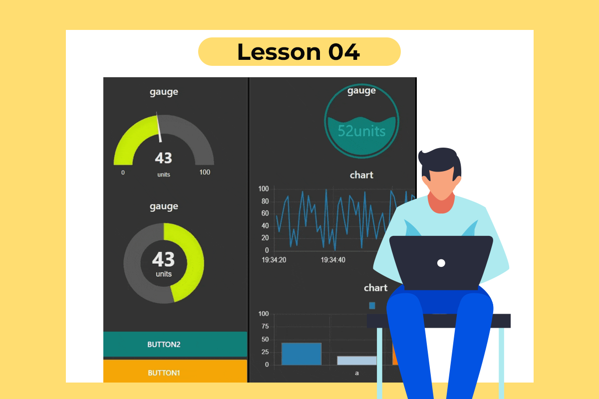
Magicblocks Dashboard is a module that provides a set of nodes in Magicblocks to quickly create a live data dashboard.
Since Magicblocks is based on the NODE-RED open-source platform you can learn more about the dashboard using the following links
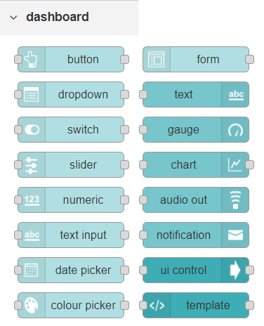
Nodes from the dashboard section provide widgets that show up in your application user interface (UI).
The user interface is organized into tabs and groups. Tabs are different pages on your user interface, like several tabs in a browser. Inside each tab, you have groups that divide the tabs into different sections so that you can organize your widgets.
Every widget should have an associated group that determines where the widget should appear on the user interface.
To create a tab and a group, follow the following instructions (see figure below):
- In the top right corner of the Magicblocks window, you have a tab called dashboard.
- Select that tab (1). To add a tab to the user interface click on the +tab button (2).
- Once created, you can edit the tab by clicking on the edit button (3)
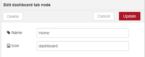
You can edit the tab’s name and change its icon
- Name: you can call it whatever you want
- Icon: you should use a name accordingly to the icon’s names in this link: https://klarsys.github.io/angular-material-icons
 After creating a tab, you can create several groups under that tab. You need to create at least one group to add your widgets. To add a group to the created tab, you need to click on the +group button (4).
- Then, you can edit the created group by clicking on the edit button (5).
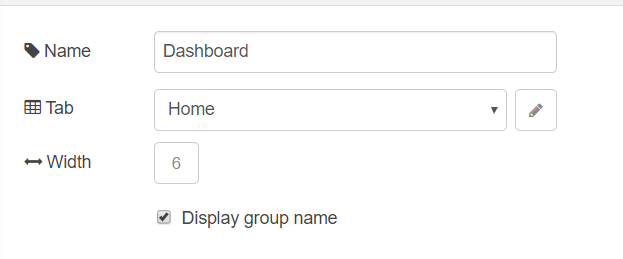
- You can edit its name, select its corresponding tab and change its width.
Dashboard Theme
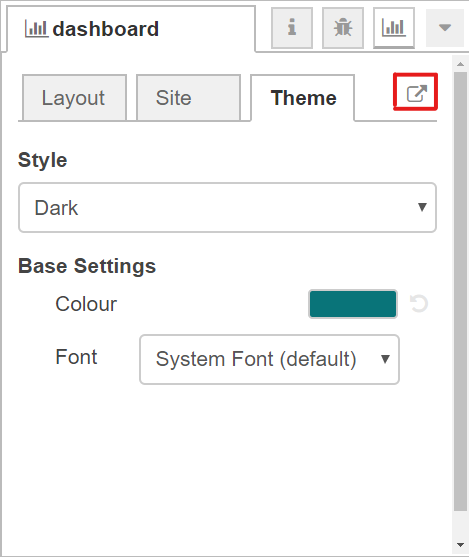
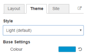
The Magicblocks Dashboard has a white background and a light blue bar by default. You can edit its colors in the Theme tab on the upright corner, as shown in the following figure.
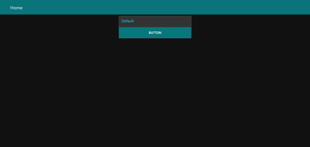
- Change the style, deploy the changes and see the Dashboard UI changing its colors. For example, like in the following figure.
Dashboard Site
At the right upper corner of the Magicblocks window, you have another tab called Site that allows you to do further customization as shown in the figure below.
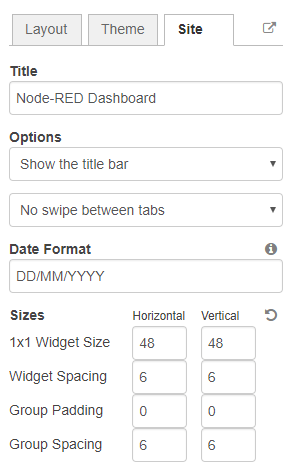 Feel free to change the settings, then deploy the changes and see how the UI looks. At the moment you won’t see much difference because you haven’t added anything to the dashboard yet. Those changes will be noticeable when you start adding widgets to the UI.
Creating a User Interface — Example
In this section we’re going to make a dashboard example to show you how you can build and edit your own dashboard – we won’t actually add functionalities to the widgets – we’ll do that in future projects. This dashboard will have the following features.
- Two different tabs: one called Room and another called Garden
- The Room tab will have two groups and the Garden tab will have one group
- We’ll add a color picker and a switch to the room groups
- We’ll add a chart to the Garden group
Creating the Tabs
In the top right corner of the Magicblocks window, select the dashboard tab and create two new tabs by clicking on the +tab button.
Edit one tab with the following properties
- Name: Room
- Icon: tv
And the other one with the following
- Name: Garden
- Icon: local_florist
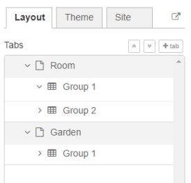
Then, add two groups to the Room tab and one group to the Garden tab. The following figure shows how your dashboard layout looks.
 Adding the Widgets
Add a switch, a slider, a color picker, and a gauge to the flow as shown in the following figure .. Image:: https://github.com/magicbitlk/Magicbit-Magicblocks.io/blob/master/Images/flow.png?raw=true
Double-click on the switch. A new window pops up.
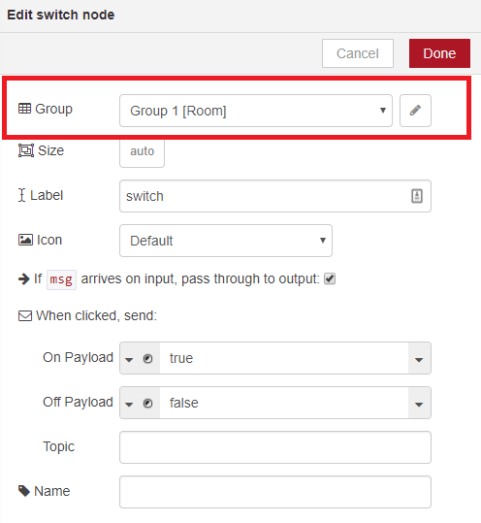
In this new window, you can choose where you want your button widget to appear. In this case, we want it to appear in the Room tab, Group 1 as highlighted in red in the previous figure.
Then, do the same for the other widgets, but add them to the following groups:
- slider: Group 1 [Room]
- color picker: Group 2 [Room]
- gauge: Group 1 [Garden]
Source: (https://randomnerdtutorials.com/getting-started-with-node-red-dashboard/)

